
Love, Racism, and Cookies: Google Trends in the United States

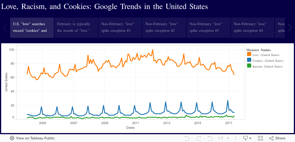
This data visualization depicts the Google Trends search charts for the words love, racism, and cookies since 2004. The chart shows search trends only for the United States.

Overall, searches for love and cookies are cyclical, with love spiking around Valentine's Day and cookies getting hot at Christmas. Racism searches are fairly consistent (other than the occasional spike), and it accounts for a much smaller portion of total Google searches than love and cookies.

Comments

Popular posts from this blog

LeBron James vs. Michael Jordan: Statistical Comparison of Their First 14 Seasons and First 12 Playoff Appearances

As we approach another Finals appearance for LeBron James, we do so in the wake of a flood of Jordan vs. James comparisons. Some say the "King" can never reach "His Airness ." Others say he's already there . It is most definitely futile to limit any "GOAT" comparison to something as simple as a ring count: Does Robert Horry's seven rings make him better than Michael Jordan's six? Is Ron Harper as equally "great" as Kobe Bryant, both of whom have five rings?  No, something as complex as the infamous "Greatest of All Time" claim requires an equally as complex data set.  What follows are graphs of the major statistical categories for LeBron James and Michael Jordan over their first fourteen seasons and first twelve playoff appearances. Jordan's career actually includes fifteen seasons and thirteen playoff appearances, but in order to see a year-to-year comparison, I only included data for the length of James...

U.S. federal spending represented by function as % of total spending: 1962-2015

If you take the data provided by the Government Publishing Office and graph the total dollars spent since 1962 on U.S. federal spending, you get something that looks like this: And while this graph is useful--it tells us that U.S. federal spending has increased semi-exponentially over the past fifty years--it doesn't paint a clear picture of how spending on each function has changed over time. To see that, we need a graph with each function represented as a percentage of total spending, which looks like this: For the majority of functions, federal spending has remained at a consistent percentage of total spending. However, for the big five--national defense, health, medicare, social security, and income security--spending has fluctuated quite drastically (both positively and negatively) over the past fifty years.  Below each function is highlighted in a separate graph. I've provided a list of sub-functions that make up the spending within the larger function al...

Justin Bieber most searched artist for 48% of the past decade (Google Trends)

I would have put my money on Taylor Swift or Beyonce, but it turns out that the Biebs has held a steady place in hearts across the world for a large portion of the past decade. Below you will find a detailed explanation of how I produced the visualization below: (If you're on mobile and unable to get the below embedded chart to load, here's a screenshot .) Getting the results for this analysis turned out to be a little more difficult than I first expected. Two things limited the speed in which I could compile what I needed: 1) Google limits the numbers of Trends comparison searches to five topics/people 2) The Trends comparisons are normalized (so if you replace the least popular of your five people with someone slightly more popular, it modifies the overall trend rating for the other four people). Knowing these two things were going to hinder my progress, I decided to start by simply getting my list of potential popular artists together. I primarily stuck with th...